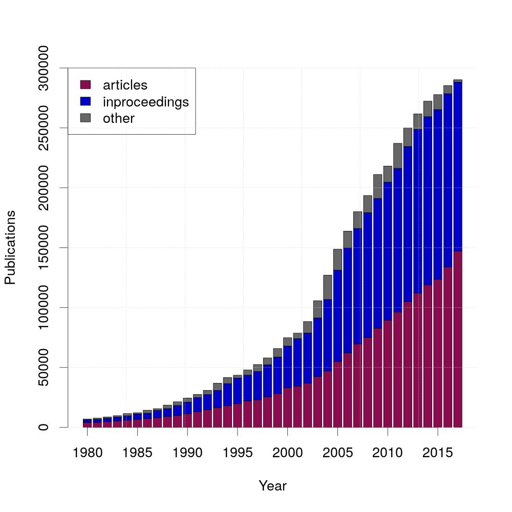
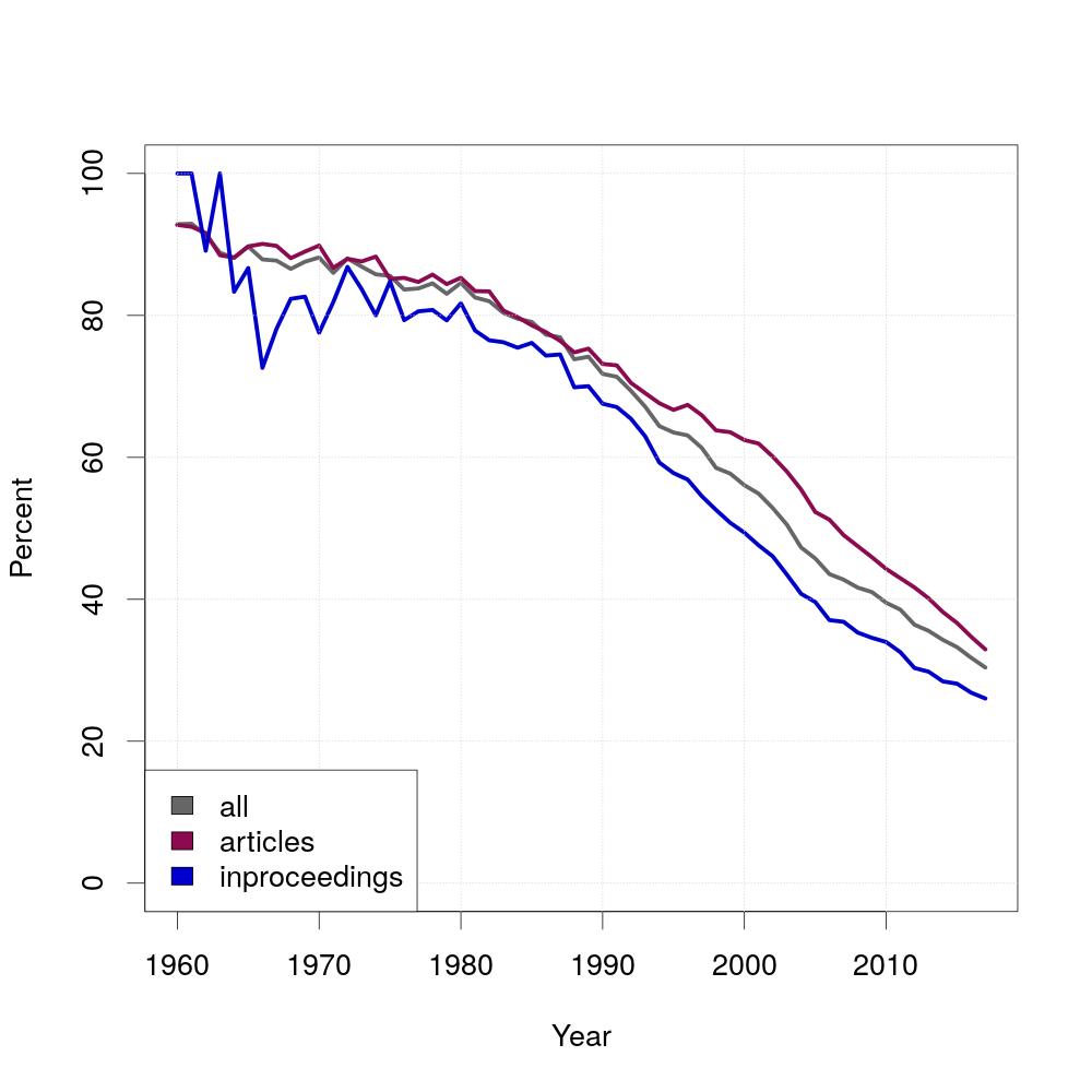
Over the years, the amount of publications grew fast. For this graph, the different kinds of publications are differenciated. The two most common ones are articles and inproceedings, that's why this diagram shows the three different kinds articles, inproceedings and others.
The diagram was created using the following R-script:
#read the tables
s <- read.table(file=file.path('all.tsv'),skip=2,sep='|')
t <- read.table(file=file.path('article.tsv'),skip=2,sep='|')
u <- read.table(file=file.path('inproceedings.tsv'),skip=2,sep='|')

#assign second columns (first column contains years and second column contains number of publications)
x = t[,2]
y = u[,2]
z = s[,2]-(x+y) #subtract articles and inproceedings from all publications

#create matrix
data=matrix(c(x,y,z), nrow=3, byrow=TRUE)
rownames(data)=c("articles", "inproceedings", "other")

#set output file
jpeg(filename="publications.jpeg", width=1000, height=1000, pointsize=27)

#plot
a <- barplot( data, xlab="Year", ylab="Publications", ylim=c(0,300000), col=c("deeppink4","mediumblue", "gray40"))
axis(1,at=seq(a[1],a[length(a)],6), labels=seq(min(unlist(t[,1])),max(unlist(t[,1])),5))
legend(x="topleft",legend=rownames(data), fill=c("deeppink4","mediumblue", "gray40"))
grid(nx=7,ny=NULL,col="lightgray")

invisible(dev.off())
psql -U $USER_NAME -d dblp -c "QUERY" > DIR/FILE.tsvSELECT publYear, COUNT(publYear)
FROM papers
WHERE publYear BETWEEN 1980 AND 2017
GROUP BY publYear
ORDER BY publYear SELECT publYear, COUNT(publYear)
FROM papers
WHERE etype = 'inproceedings'
AND publYear BETWEEN 1980 AND 2017
GROUP BY publYear
ORDER BY publYear SELECT publYear, COUNT(publYear)
FROM papers
WHERE etype = 'article'
AND publYear BETWEEN 1980 AND 2017
GROUP BY publYear
ORDER BY publYear 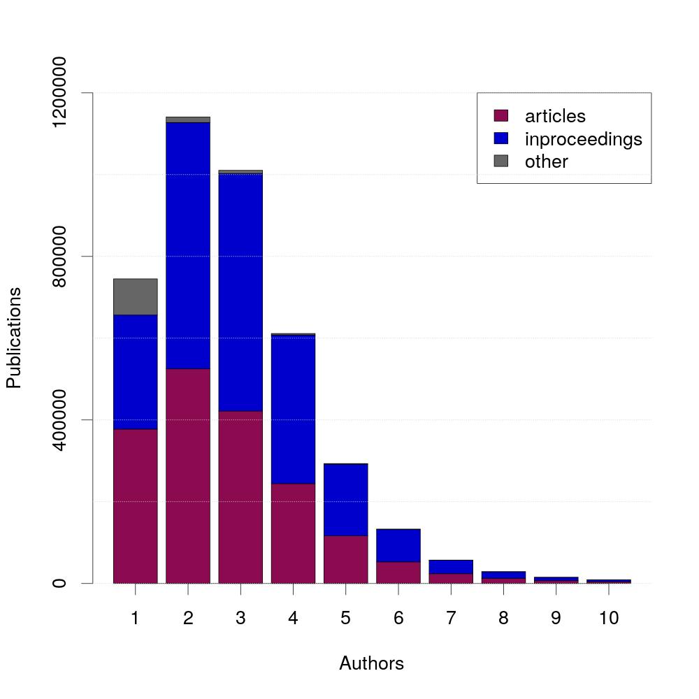
The largest amount of publications is written by exactly two authors. Additionally, 95% of publications are written by five or less authors.
The diagram was created using the following R-script:
#read tables
s <- read.csv(file=file.path('all.tsv'),skip=2,sep='|')
t <- read.csv(file=file.path('article.tsv'),skip=2,sep='|')
u <- read.csv(file=file.path('inproceedings.tsv'),skip=2,sep='|')

#set number of bars shown in diagram
numberofbars=10
#assign second columns (first column contains number of authors and second column contains number of publications)
x = head(t[,2],numberofbars)
y = head(u[,2],numberofbars)
z = head(s[,2],numberofbars)-(x+y) #subtract articles and inproceedings from all publications
#create matrix
data=matrix(c(x,y,z), nrow=3, byrow=TRUE)
rownames(data)=c("articles", "inproceedings", "other")

#set output file
jpeg(filename="authors_per_publication.jpeg", width=1000, height=1000, pointsize=27)

#plot
a <- barplot( data, xlab="Authors", ylab="Publications", ylim=c(0,max(unlist(t[,2]))), col=c("deeppink4","mediumblue", "gray40"))
axis(1, at=a, labels=c(1:numberofbars))
legend(x="topright",legend=rownames(data), fill=c("deeppink4","mediumblue", "gray40"))
grid(nx=0,ny=NULL,col="lightgray")

invisible(dev.off())
SELECT authors, COUNT(authors)
FROM    (SELECT  COUNT(aid) AS authors
         FROM    writtenby
         JOIN    papers
                 ON papers.pid = writtenby.pid
       	 GROUP   BY papers.pid)x
WHERE  etype = 'article'
GROUP  BY authors
ORDER  BY authors
SELECT authors, COUNT(authors)
FROM (SELECT COUNT(aid) AS authors
FROM writtenby
JOIN papers
ON papers.pid = writtenby.pid
GROUP BY papers.pid)x
WHERE etype = 'inproceedings'
GROUP BY authors
ORDER BY authorsSELECT authors, COUNT(authors)
FROM (SELECT COUNT(aid) AS authors
FROM writtenby
GROUP BY pid)x
GROUP BY authors
ORDER BY authors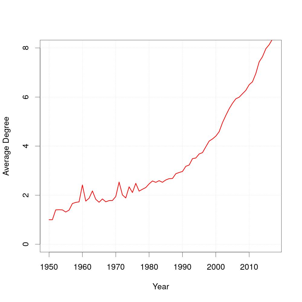
As you can see, the average degree of coauthors has changed over time. The query does not accumulate the coauthors from the prior years, the number of coauthors is the average number of authors an author has worked with in that specific year.
The diagram was created using the following R-script:
#read table
t <- read.table(file=file.path('average_degree.tsv'),skip=2,sep='|')

#assign first and second column (first column contains the years and second column contains the degree)
x=t[,1]
y=t[,2]

#set output file
jpeg(filename="average_degree.jpeg", width=1000, height=1000, pointsize=27)

#plot
plot(0,0,xlab="Year",ylab="Average Degree", col="darkblue", ylim=c(0,max(unlist(y))), xlim=c(1950,10*ceiling(max(unlist(x))/10)))
grid(NULL,NULL,col="lightgray")
lines(x,y, col="red", lwd=3)

invisible(dev.off())
SELECT publyear, AVG(coauthors)
FROM   (SELECT   DISTINCT a.aid, COUNT(a.aid) AS coauthors, publYear
        FROM     papers, writtenby AS a
        JOIN     writtenby AS b
                 ON a.pid = b.pid
        WHERE    NOT a.aid = b.aid AND papers.pid = a.pid
        GROUP    BY publYear, a.aid)x
WHERE  publYear <= 2017
GROUP  BY publYear
ORDER BY publYear 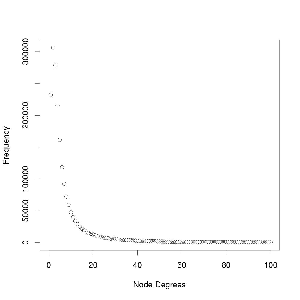
This experiment analyzes the number of coauthors an author has. The diagram shows the frequency of a specific number of coauthors (node degree). The amount of coauthors is the number of authors an author has ever worked with and is not paper-specific. This experiment does not include soloauthors, which are authors that have never worked with another author.
The diagram was created using the following R-script:
#read table
t <- read.table(file=file.path('degree_distribution.tsv'),skip=2,sep='|')

#assign first and second column (first column contains the node degrees and second column contains the frequency)
x=head(t[,1],100)
y=head(t[,2],100)

#assign output file
jpeg(filename="degree_distribution.jpeg", width=1000, height=1000, pointsize=27)

#plot
plot(x, y, xlim=c(0,100), ylim=c(0, max(y)), xlab="Node Degrees", ylab="Frequency")

invisible(dev.off())
SELECT coauthors, COUNT(coauthors)
FROM   (SELECT COUNT(DISTINCT coauthor) AS coauthors
        FROM   authorpairs
        GROUP  BY aid)y
GROUP  BY coauthors
ORDER  BY coauthors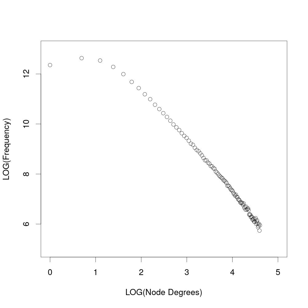
When shown logarithmic, the results from the experiment above show that the degree distribution follows a power law.
The diagram was created using the following R-script:
#read table
t <- read.table(file=file.path('degree_distribution.tsv'),skip=2,sep='|')

#assign first and second column (first column contains the node degrees and second column contains frequency)
x=head(t[,1],100)
y=head(t[,2],100)

#set output file
jpeg(filename="degree_distribution_log.jpeg", width=1000, height=1000, pointsize=27)

#plot
plot(log(x), log(y), xlim=c(0,5), ylim=c(5,13), xlab="LOG(Node Degrees)", ylab="LOG(Frequency)")

invisible(dev.off())
In Mathematics, the authors of papers are usually ordered alphabetically and since Computer Science originated from Mathematics, the question is whether the same applies for Computer Science. The diagram shows the result for this question. The percentage of alphabetically ordered papers started at almost 100 percent and decreased over time. For this experiment, you need to generate a new table called position, which is similar to writtenBy with the difference that the authorposition is ordered by the last name of the authors.
The diagram was created using the following R-script:
#read tables
s <- read.csv(file=file.path('all.tsv'),skip=2,sep='|')
t <- read.csv(file=file.path('article.tsv'),skip=2,sep='|')
u <- read.csv(file=file.path('inproceedings.tsv'),skip=2,sep='|')

#assign first columns (years)
x1=s[,1]
y1=t[,1]
z1=u[,1]
#assign second columns (percentage of alphabetical papers)
x2=s[,2]
y2=t[,2]
z2=u[,2]

#set output file
jpeg(filename="authorposition.jpeg", width=1000, height=1000, pointsize=27)

#set minimum of x axis
xmin=max(min(unlist(x1)), min(unlist(y1)), min(unlist(z1)))

#plot
plot(1, xlab="Year", ylab="Percent", col="darkblue", ylim=c(0,100), xlim=c(xmin,10*ceiling(max(unlist(x1))/10)))
lines(x1,x2, col="gray40", lwd=5)
lines(y1,y2, col="deeppink4", lwd=5)
lines(z1,z2, col="mediumblue", lwd=5)
grid(NULL, NULL, col="lightgray")
legend("bottomleft", fill=c("gray40","deeppink4","mediumblue"), legend=c("all", "articles", "inproceedings"))

invisible(dev.off())
CREATE TABLE position AS
  (SELECT pid, writtenBy.aid, Rank()
          OVER (partition BY pid ORDER BY lastname)
   FROM   authors
   JOIN   writtenBy
          ON writtenBy.aid = authors.aid
   ORDER  BY pid)
SELECT     y.publYear, 100 * (1 - (COALESCE(x.c,0)) / y.c)
FROM       (SELECT publYear, 1.0 * COUNT(DISTINCT position.pid) AS c
            FROM   (papers
                    JOIN   position
                           ON papers.pid = position.pid)
                    JOIN   writtenBy
                           ON (position.pid, position.aid) = (writtenBy.pid, writtenBy.aid)
            WHERE  NOT apos = rank
            GROUP  BY publYear)x
RIGHT JOIN (SELECT publYear, 1.0 * COUNT(DISTINCT position.pid) AS c
            FROM   papers
            JOIN   position
                   ON papers.pid = position.pid
            GROUP  BY publYear)y
           ON x.publYear = y.publYear
WHERE      x.publYear <= 2017
ORDER      BY publYear
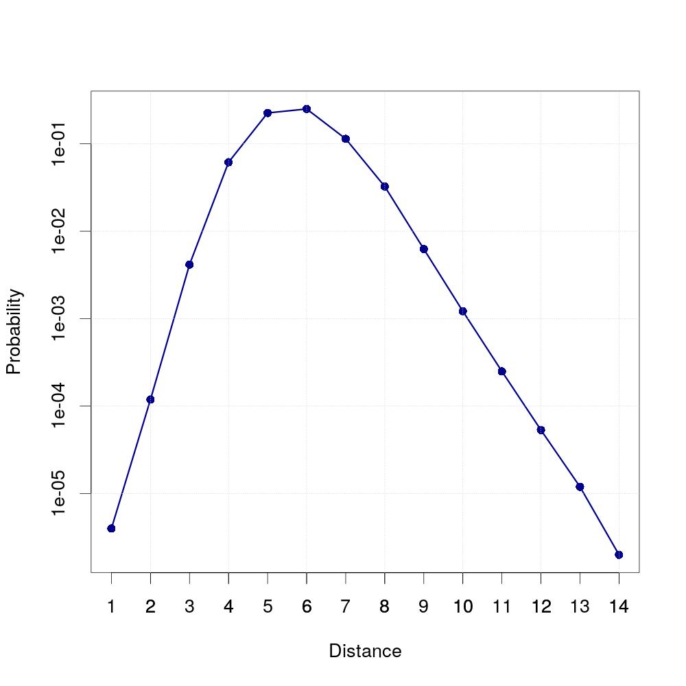
When you take a few randomly selected authors and determine their number of coauthors and the number of authors these coauthors have worked with and continue this until there are no new authors left which are in any way connected to the first author, you will get the result that the most authors an author is connected to are at the distance of six (on average). We randomly selected 20 authors for this experiment. For every one of them, we determined the amount of coauthors this author has at the given distance. The average of coauthors at a given distance is then divided by the total number of authors, which results in a probability for two authors to be coauthors of a specific distance.
The diagram was created using the following R-script:
#read table
t <- read.table(file=file.path('smallworld.tsv'),skip=2,sep='|')

#assign first and second column (first column contains distance, second column contains probability)
x=t[,1]
y=t[,2]

#set output file
jpeg(filename="smallworld.jpeg", width=1000, height=1000, pointsize=27)

#plot
plot(x,y,log="y",type="o",pch=16, col="darkblue", lwd=3,xlab="Distance",ylab="Probability", xlim=c(min(x),max(x)), xaxt="n")
axis(1,at=x)
grid(NULL,NULL,col="lightgray")

invisible(dev.off())
SELECT distance, AVG(coauthors)/(SELECT COUNT(*) FROM authors)
FROM   (SELECT distance, COUNT(coauthor) AS coauthors
        FROM   Generate_series(1,10) AS i, lateral (
	       WITH RECURSIVE ta(n, coauthor, path, cycle) AS
               (SELECT 0 AS n, x.aid, array[x.aid], false
                FROM   (SELECT i, (i - i + random() * (SELECT MAX(aid) FROM authors))::integer AS aid)x
                UNION  ALL
                SELECT n+1, a.coauthor, path || a.coauthor, a.coauthor = ANY(path)
                FROM   authorpairs a INNER JOIN ta t ON a.aid = t.coauthor WHERE NOT cycle)
                SELECT DISTINCT MIN(n) AS distance, coauthor, i
                FROM   ta
                GROUP  BY coauthor)y
        WHERE  NOT distance=0
        GROUP  BY distance, y.i
        ORDER  BY y.i)z
GROUP  BY distance
ORDER  BY distance

Publications with the given Keyword in the title: No Keyword!
Here, you can search for the number of titles with a given keyword in them. There are two ways of searching keywords. You can either search for a single trendword query (it can contain multiple words), enter it above. The shown graph will distinguish between articles, inproceedings and other publication types. To search for multiple trendword queries, please enter them seperated with semicolons, i.e. "graph;tree". This diagram will not distinguish between different publication types, but it will show all the searched trendwords in the same graph. The search is case insensitive.
R-script for a single trendwordSELECT x.publYear, COALESCE(COUNT,0)
FROM (SELECT DISTINCT publYear
FROM papers
WHERE publYear IS NOT NULL)x
LEFT JOIN (SELECT publYear, COUNT(*) AS COUNT
FROM papers
WHERE title ILIKE '%keyword%' AND publYear IS NOT NULL
GROUP BY publYear)y
ON x.publYear = y.publYear
WHERE x.publYear <= 2017
ORDER BY publYear
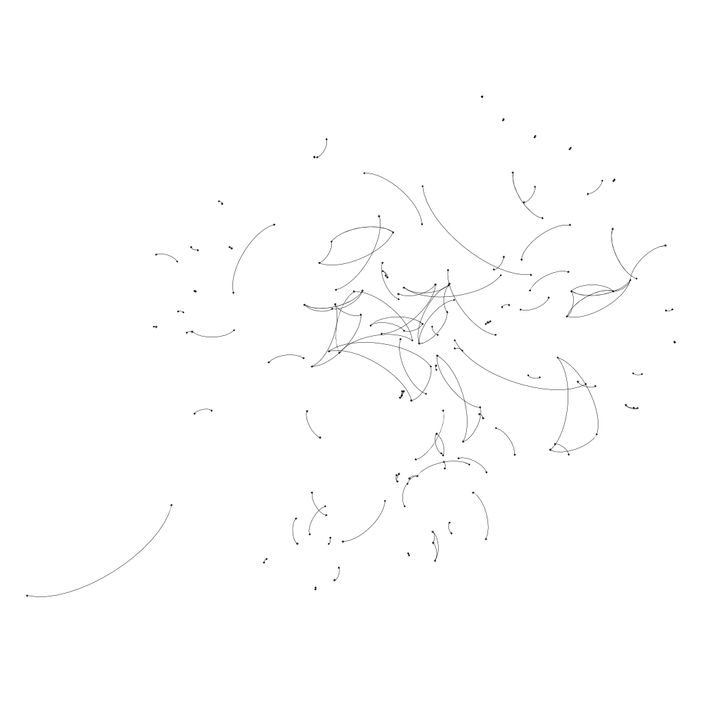
These graphs show the evolution of the connection of authors. Each node represents an author. If two authors have ever worked together up to the given year, they are connected by an edge. Given that the number of authors and the average number of couthors have increased over time, the coauthor graph grows very fast.
The graphs were created using Gephi. with the following instructions:
1. Open first graph in Gephi.
2. Click on "Data Laboratory".
3. Choose the button "Nodes" inside of "Data Table".
4. Select all nodes and right-click -> "Edit all nodes".
5. A sidebar should appear on the left side. Click the "..." Button at "Interval" and specify an interval in the new text field in the format "[n,m]" (note that m>n, e.g. [0,10]).
6. Do the same for all edges (click "Edges" on the top, select all and specify interval).
7. Open the next graph ("File -> Open..."). Select "append" instead of "new graph" in the dialog.
8. Select all Nodes/Edges in the Data Laboratory that don't have an interval and specify the next interval (e.g. [1,10]).
9. Repeat steps 7 and 8 for all graphs.
10. Click on "Overview" to show the graph. On the left, you can select different layout-algorithms.
11. Click on "Enable Timeline" on the bottom.
12. Click on the "Settings" symbol and "set Costum Bounds". Now select an interval so that it always contains just one step.
13. Now you can move the box in the timeline and build the graph.
14. To save the current image, click on "Preview" at the top. On the left, you can configure the format of the preview and in the drop-down box at the top, you can select some defaults.
15. With "Refresh", you can refresh the preview and export it with "export SVG/PNG/PDF".
16. Repeat that for every version of the graph and you'll get graphs that grow but keep the same layout.
SELECT DISTINCT a.aid, b.aid
FROM   papers, writtenby AS a
JOIN   writtenby AS b
       ON a.pid = b.pid
WHERE  NOT a.aid = b.aid AND papers.pid = a.pid AND publyear <= 1950